A Crisp And Bright Kitchen Renovation That is Super Kid-Friendly From One Of Our Very Own EHD Insiders
Back in June, we launched our EHD Insider Community to give readers access to more behind the scenes content as well as offer a space for design enthusiasts. Members can share their projects, design agonies, ask questions, generally talk about design with the awesome members, and pitch ideas for future stories on the blog. It has been SO fun but the most rewarding part is seeing the amazing and talented designers that make up our readership. One of those people is today’s featured designer, Chris McGovern. In 2018, Chris launched McGovern Project, an NYC based full-service residential and commercial interior design firm, following a decade long career in finance. When he reached to share this project with us, we knew it was something our readers should see, especially with its emphasis on small space and kid-friendly solutions.
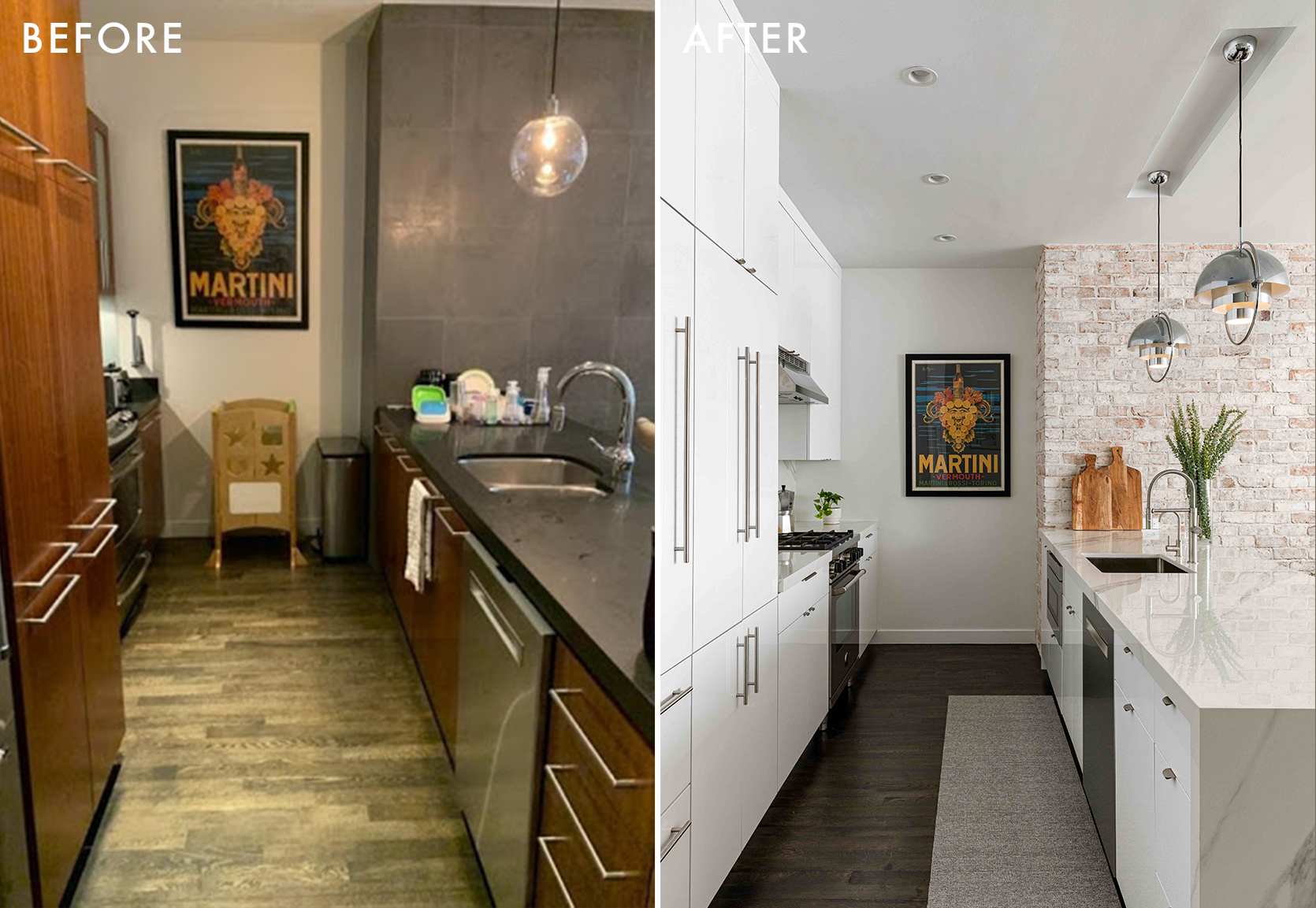
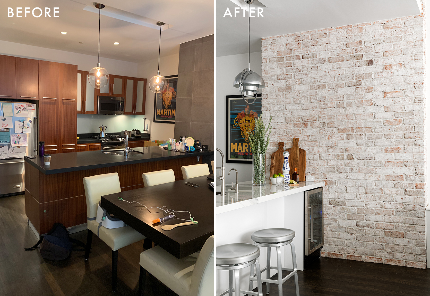
This project came about when a former colleague of Chris’s reached out to explore a kitchen renovation. Chris began working with the family on designing a kitchen that was kid-friendly for the couple’s two young boys but didn’t skimp on design. The kitchen already had good bones but the client wanted a clean, uncluttered, light kitchen with optimal storage with durable countertops and cabinetry. Here’s what he was working with:
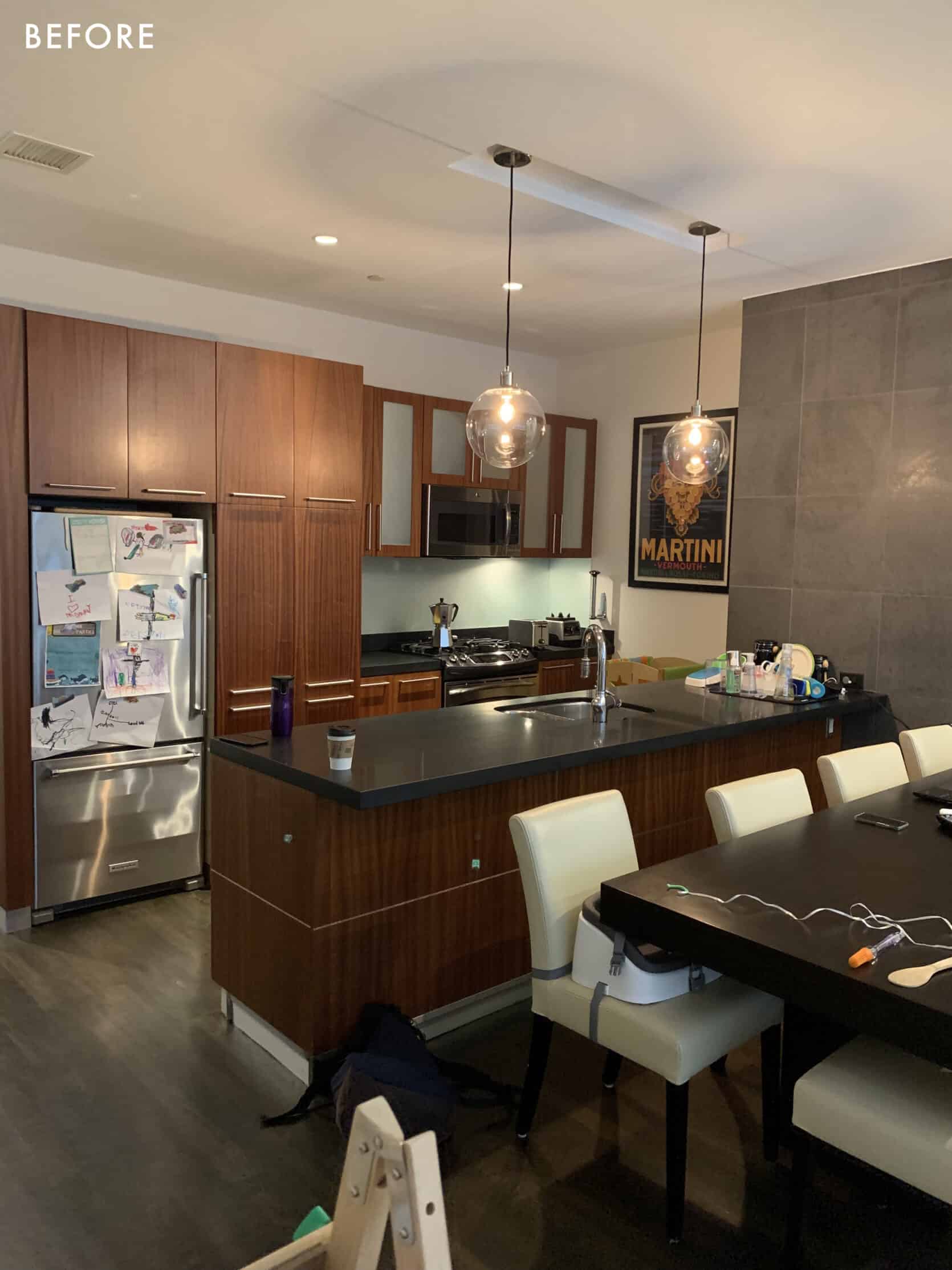
One of the main focuses (besides durability) was making the kitchen more functional and optimizing storage space. Especially in New York, every inch of the apartment counts so he wanted to make use of any unused space.
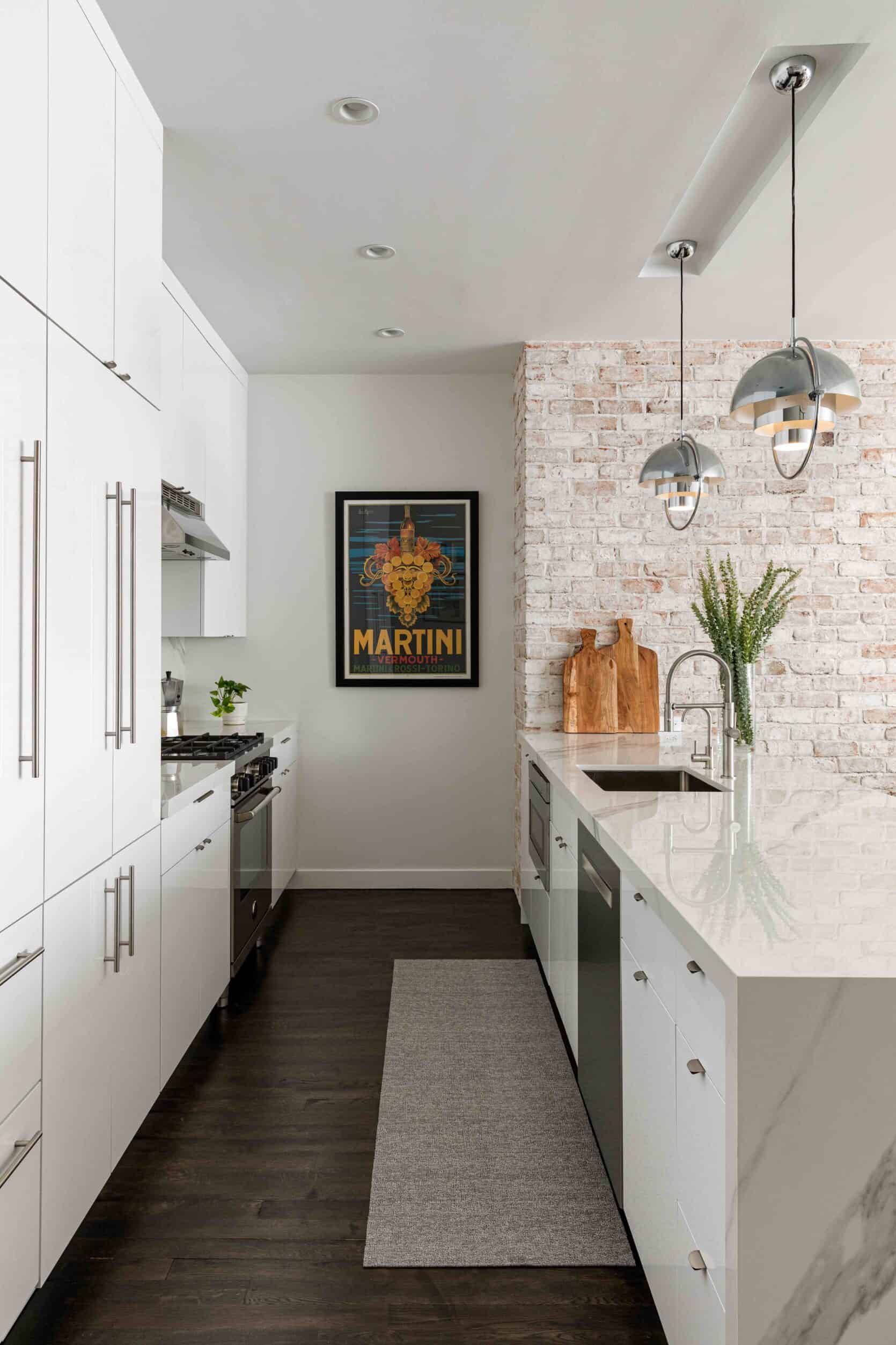
Brick Veneer | Cabinetry | Pendants | Dishwasher | Range and Hood | Refrigerator | Countertop
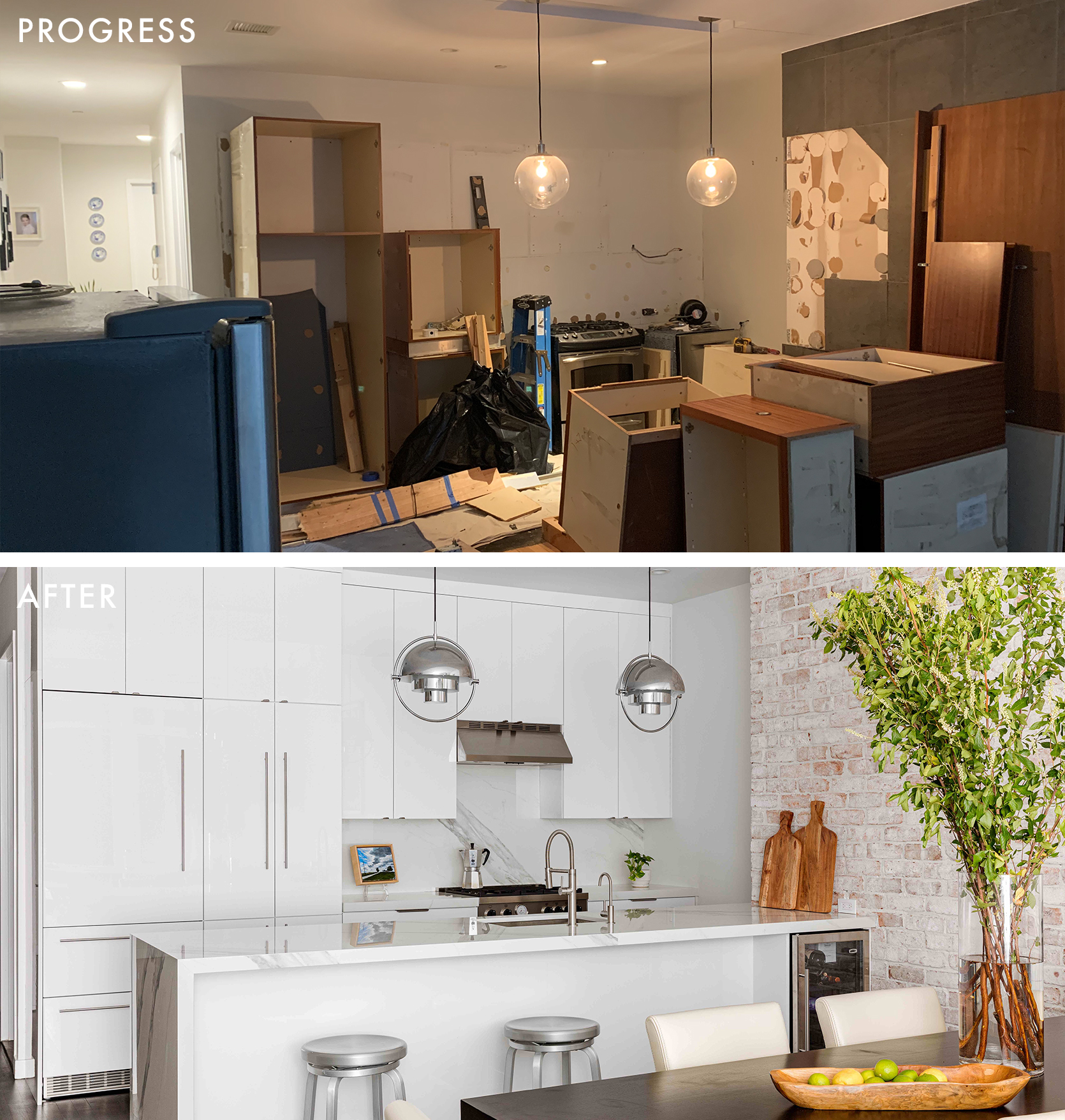
He kept the original layout of the kitchen but utilized light-colored materials and cabinetry to brighten up the space. What struck us most about this project was the transformation that occurred with the choice of materials and integrated appliances. So I wanted to chat with Chris about his design choices that brought his client’s dream kitchen to life:
Brick Vaneer | Microwave
We love the brick veneer! Do you have any tips for using this material?
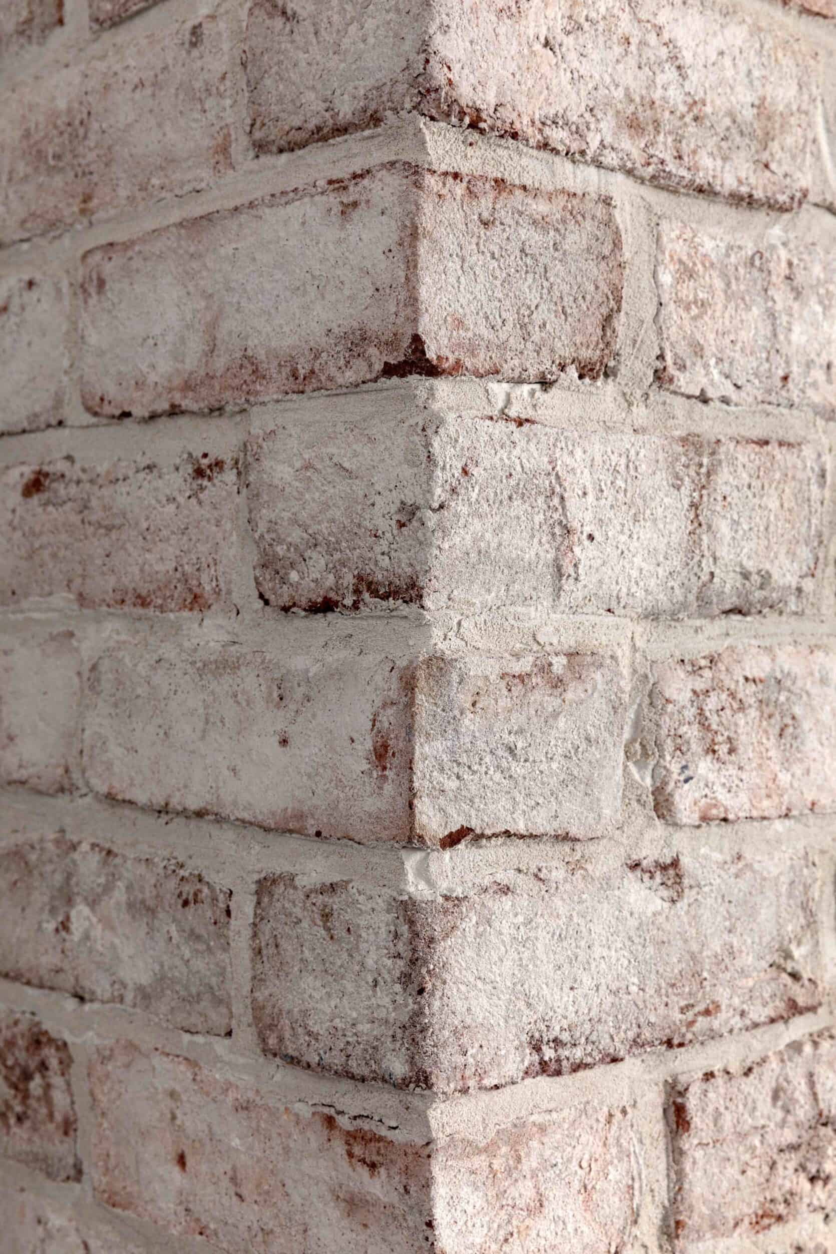
With any brick veneer product, the goal is to make it look as authentic as possible. From my perspective, the dead giveaway is the external corners. We joked that we just didn’t want it to look like a Pret-a-Manger or other commercial space where sheets of faux brick are used. The Brick-It veneers come with corner bricks that wrap around any external corners.
Can you tell us more about the other materials you used? What makes them so durable?
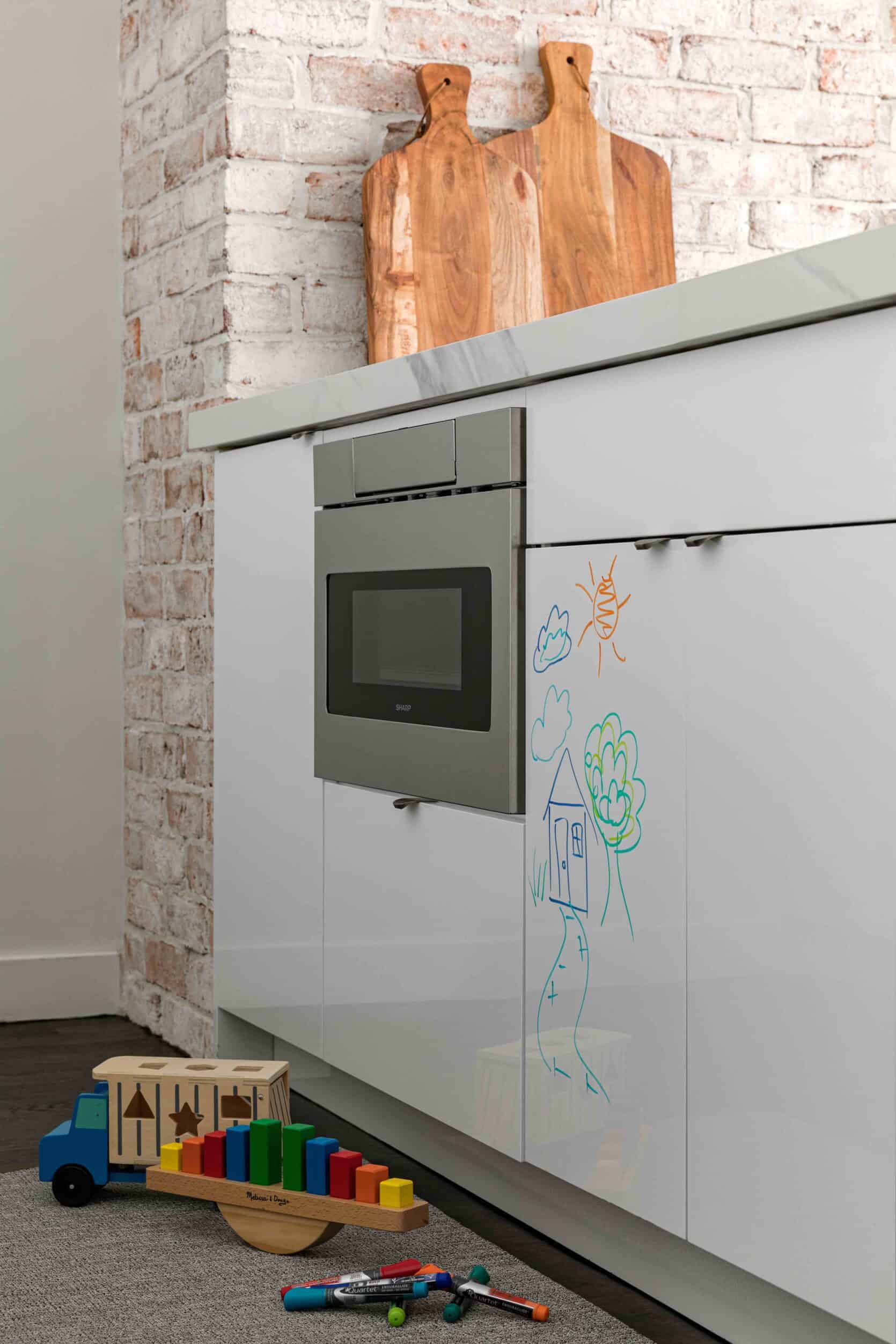
For the cabinetry, we opted for a premium door – a high gloss acrylic door from Ultracraft which is stain and scratch resistant (as pictured above, you can even write on it with marker!). However, given the open, galley layout of the kitchen, we didn’t feel compelled to take on the expense of a full custom kitchen. Ultracraft offers free, custom size modifications for most of their stock cabinetry, which allowed us to achieve a custom look, where necessary.
For the counters, we used Dekton by Cosentino, which has all the benefits of quartz but is also heat resistant. It’s typically used in outdoor and commercial applications. The product demo at the showroom, where the sales manager poured nail polish on the countertop and lit it on fire, only to reveal a pristine counter underneath, sold my clients. If the homeowner or any of their guests forget to use a trivet for a hot plate or don’t immediately tend to spilled red wine, they can rest easy that the counter will look as good as it did upon installation.
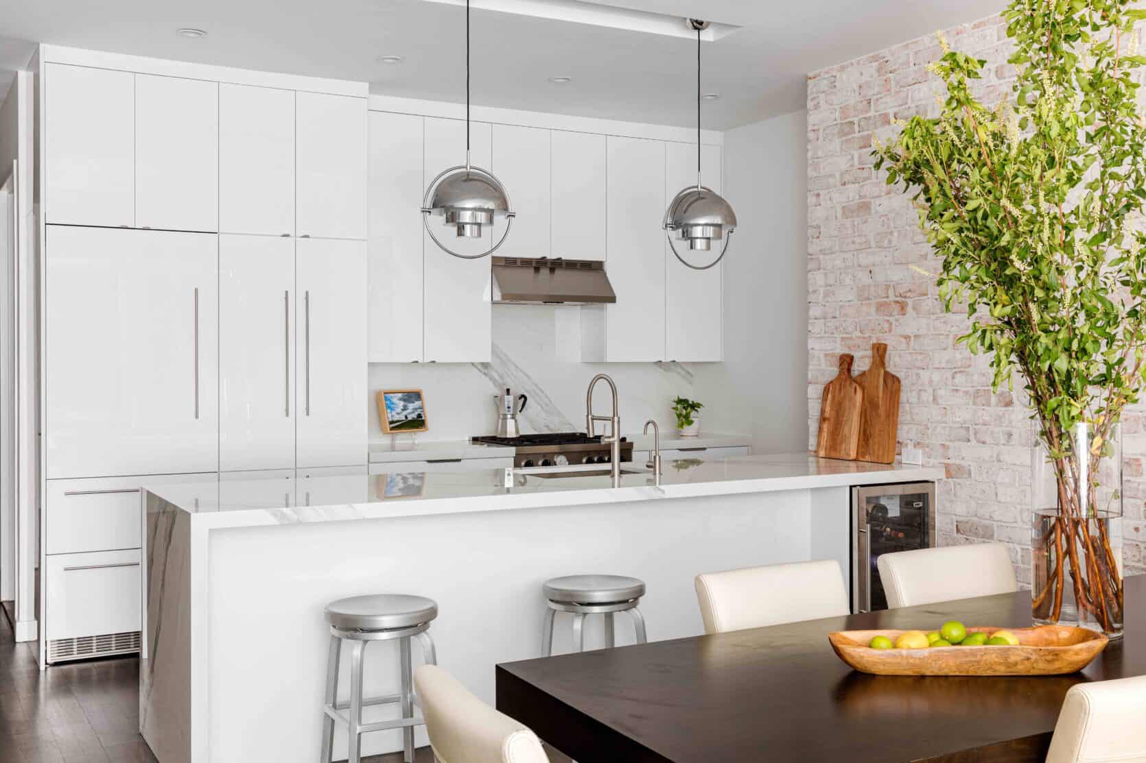
Wine Refrigerator | Pendants | Faucet
Were there any design hurdles or roadblocks when designing the space?
The previous refrigerator was full-sized, and the previous cabinetry made an effort to appear built-in. As such, the cabinetry extended around 6” beyond the counters to accommodate a full-size refrigerator. In a spacious suburban home that works fine, but in an apartment, every inch counts. It made the galley of the kitchen feel tight. We opted for a panel ready, counter depth refrigerator, and flanked it with a pantry the same depth for a seamless, integrated look that was flush with the counters.
What was the most important thing to your client besides making the space kid-friendly?
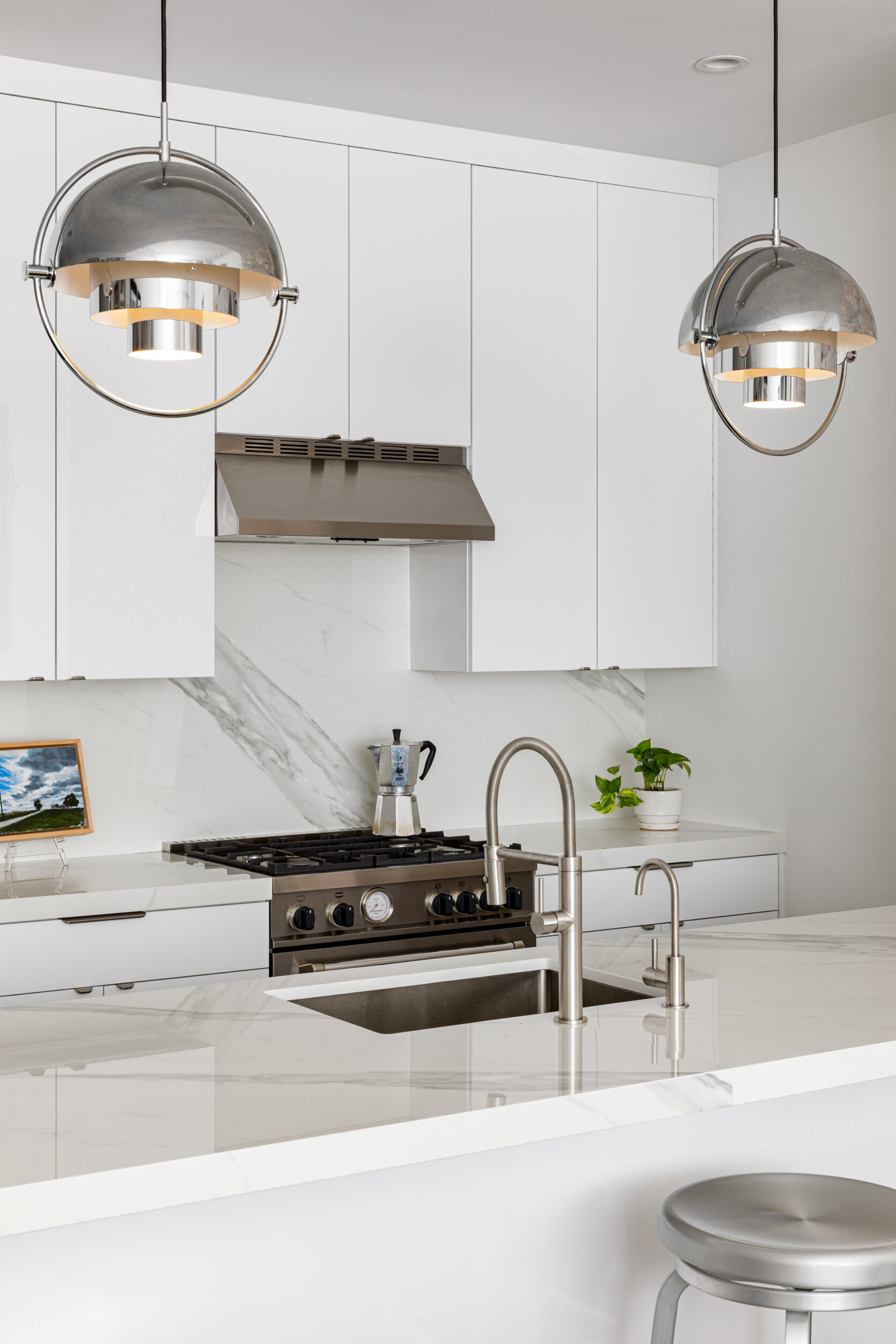
One of the most important aspects was storage. We maxed out storage by using all of the vertical space with cabinetry up to the ceiling. We also extended cabinetry an extra 12” on the back wall, previously unused wall space, and extended the peninsula to line up with the back wall. In doing so we gained enough space to squeeze in a pull-out trash bin.
Their previous kitchen lacked drawers and most base cabinetry contained shelves. Drawers were added for utensils on the base cabinetry on either side of the range, and the cabinet doors conceal two pull out trays for pots/pans. Similarly, the previous pantry contained only shelves, making it difficult to access items in the back. The new pantry has pull-outs for all lower shelves to better
access to ALL the snacks.
We also replaced the above-range microwave with a simple stainless hood and added in a drawer microwave (with concealed buttons) to the peninsula. It creates a nicer focal point on the range wall and overall is less visually heavy. Minimal edge pulls were added to the cabinets throughout. We opted for hardware with rounded edges to avoid the potential snag on a pocket or sharp corner for the kids, while not detracting from the simplicity of the new cabinetry.
Big thanks to Chris McGovern for allowing us to feature this amazing space. If you want to see more of his work be sure to give him a follow on Instagram. xx
Design by Chris McGovern | Photography by Sean Litchfield




Leave a comment