I’m refreshing a few rooms in my house and am taking a look at paint colors. Some I have had samples of in the past but not used, a few I have used in the past and may reuse. So as I am going through and organizing ideas again, I thought I would share some of the pretty Farrow & Ball paint colors that I’m looking at:
DIMPSE
Farrow and Ball describes Dimpse as a cool and delicate grey. With its subtle blue undertones it’s a happy gray, kind of reminds me of greys you would see in France.


Blackened
Farrow & Ball’s coolest white, with the slightest hint of grey, was historically made with the addition of lamp black pigment gathered from the smoke of burning oil lamps. Blackened sits perfectly with each of our Architectural Neutrals for a minimal look or stronger industrial feel. It’s particularly spectacular when used in Full Gloss within stainless steel kitchens, or when paired with All White for an uncompromisingly modern finish.


Pavillion Blue

Carolyn Thayer interiors.

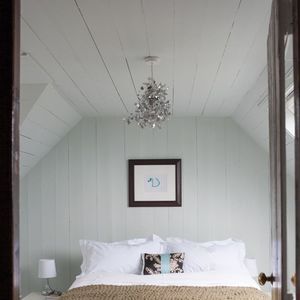
PALE POWDER
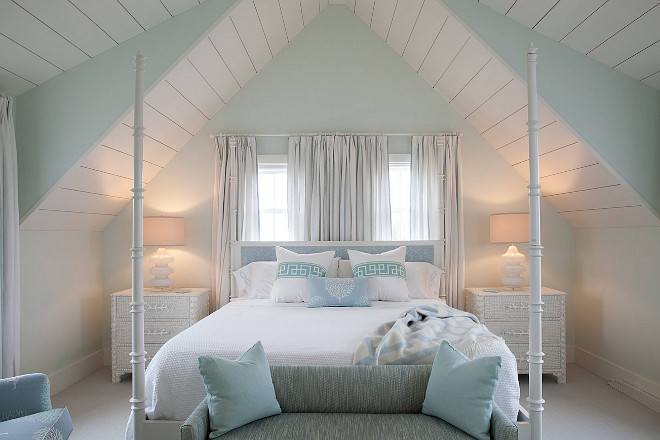
It’s their most popular shade of aqua which is a lighter version of an archived Farrow & Ball colour, Powder Blue. Pale Powder has an unparalleled softness and in north facing rooms can read almost as a delicate grey, but it is rarely cold due to the addition of green pigment. It is a great favourite for use in pretty attic bedrooms where it can be brushed onto both ceiling and walls to create an airy feeling of light and space.


Borrowed Light
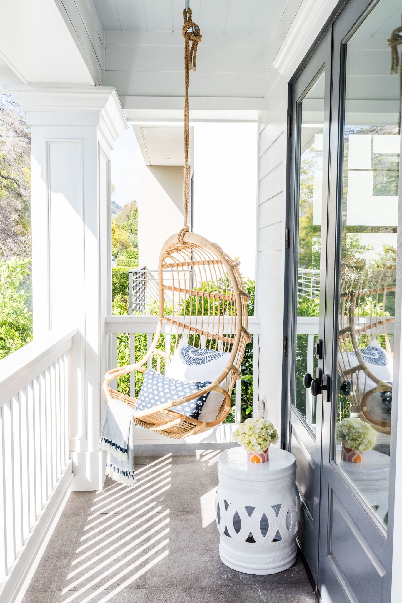
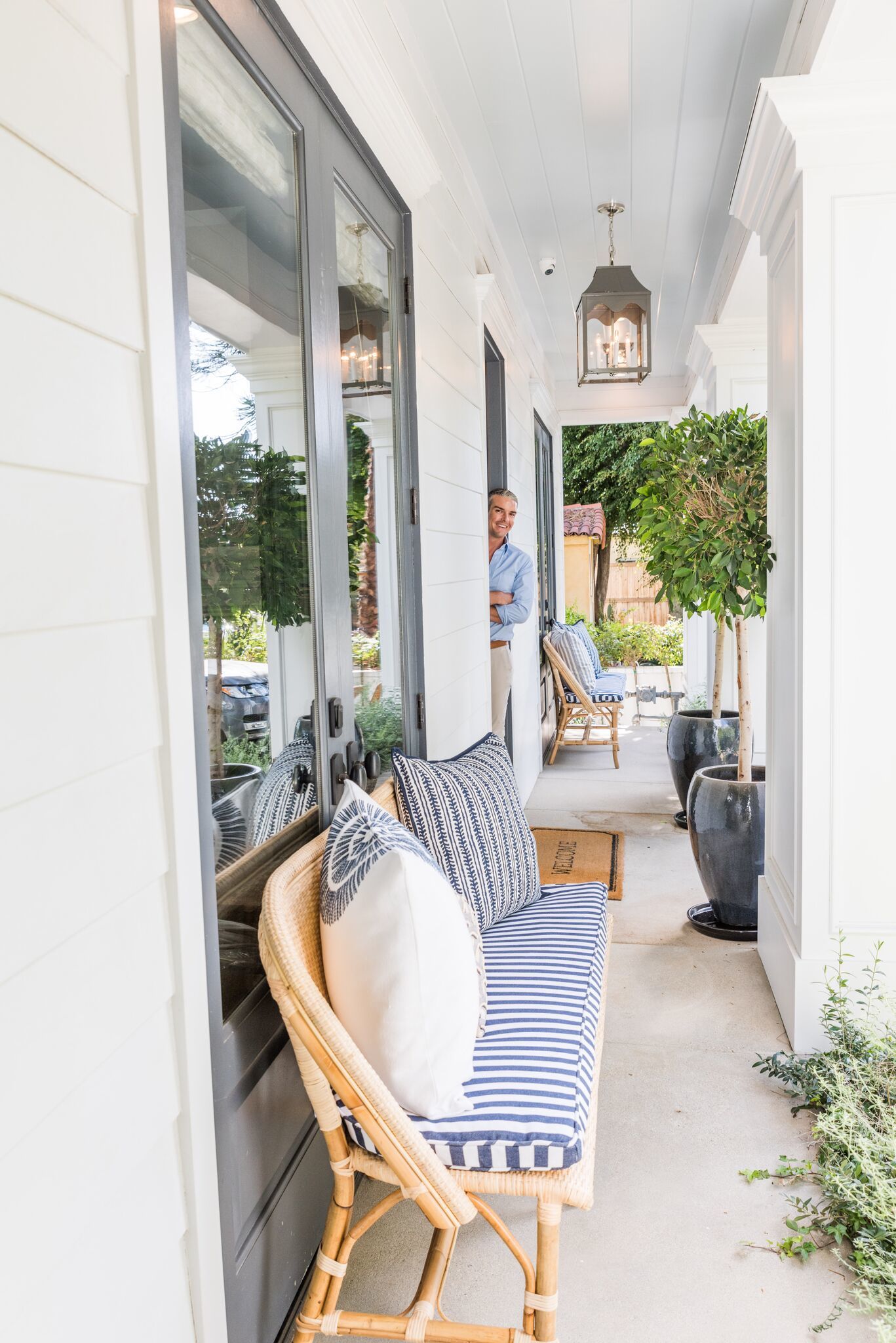
Evoking the colour of summer skies, Borrowed Light is a wonderfully pale blue named after the delicate light that cascades through small windows and fanlights. It works as well in a room deprived of light as it does in an airy sunroom. This soft and classic tone is perfectly suited to children’s bedrooms.





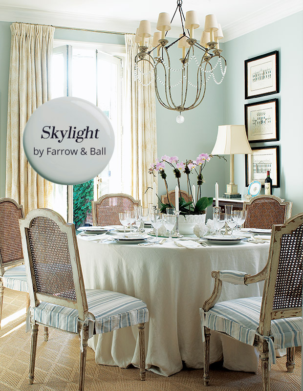
Skylight
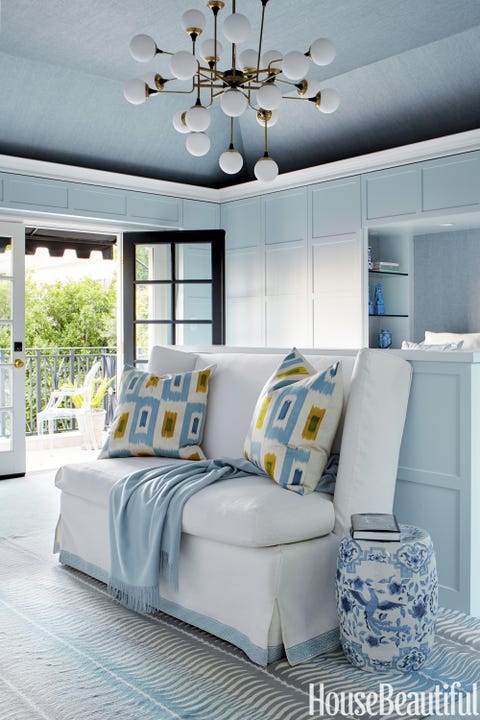
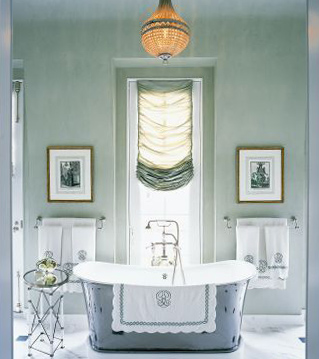
This pale blue grey takes its name from the soft natural light that often pours through ceiling skylights. However, it is less reflective than Borrowed Light, reading as a definite cool blue when used in small spaces but becoming paler and greyer when used in larger areas.

Parma Gray
Reading as a cool blue, Parma Gray is another colour attributed to the great colourist John Fowler. Used as the backdrop to numerous costume dramas, it creates the perfect period feel when contrasted with Wimborne White. Though its cool nature can feel quite formal when contrasted with a bright white, it is a firm favourite for those who prefer a clean and crisp finish.
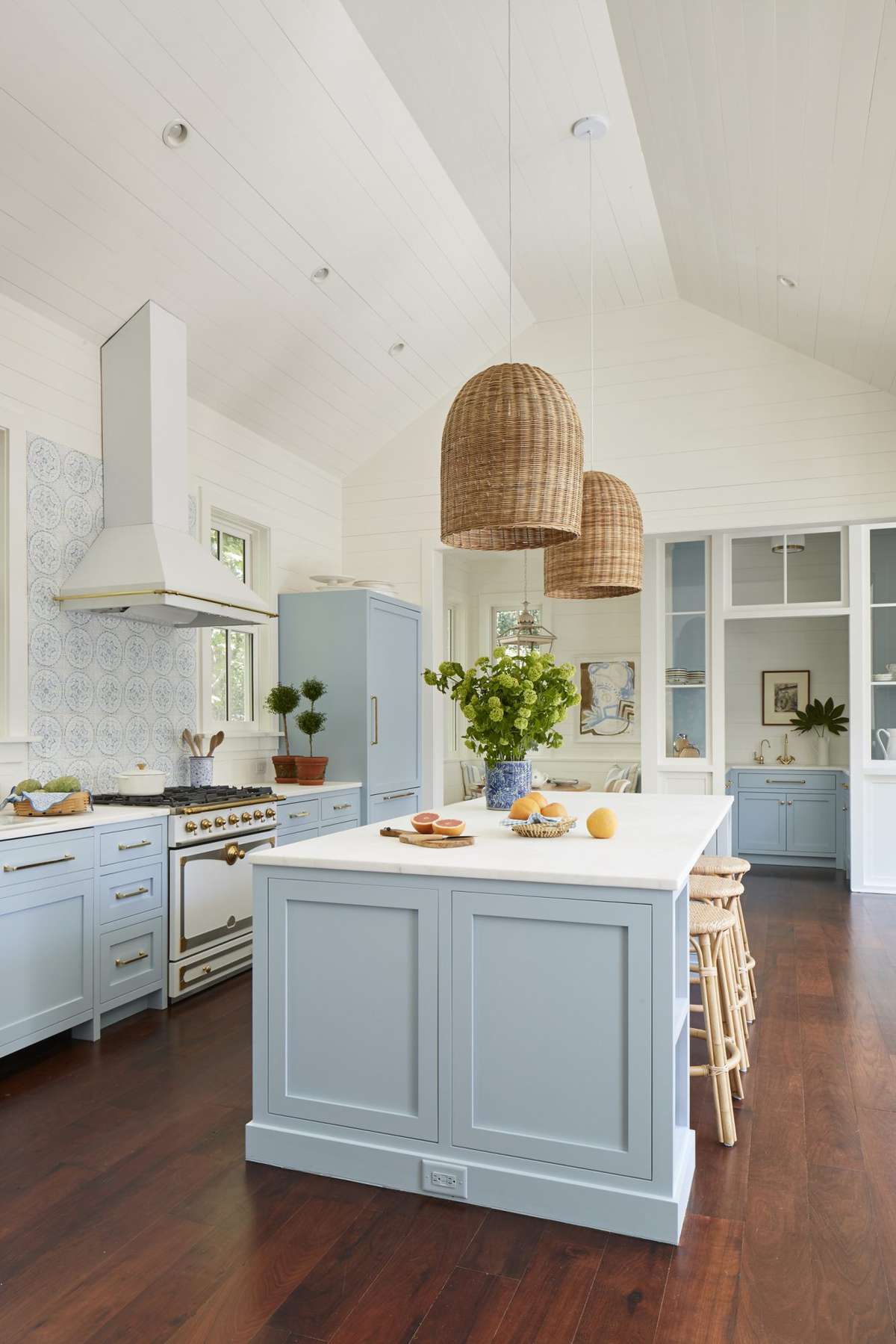


Cabbage White
A subtle white with the slightest hint of blue, Cabbage White takes its name from the most delicate of butterflies. This palest of blues is perfect for rooms that go up into the eaves where you want to use just one colour on both walls and ceiling.


That’s all for this evening! Post your comments below on which colors you like from this post, or if you have used any of them before!


Leave a comment